Best practices for lighting range from selecting quality lamps to proper placement of fixtures and so much more. But when it comes to selecting the right hues for outdoor lighting, there is only one hard and fast rule of thumb, and that rule is that it’s all subjective.
“Lighting and color preferences are very subjective, and the demographics across the United States sometimes dictate the preference,” says Tom Garber, president of EmeryAllen LLC, based in Charleston, South Carolina. “For instance, in Las Vegas and the mountainous states, it’s all about 2,700 [Kelvin], you can’t sell a 3,000 K bulb. In Florida, it is 3,000 K or maybe 4,000 K. If you get a client from South America or Europe, they might be used to a lot bluer light, and maybe they prefer 4,000 K or 5,700 K.”
As a contractor also working in Charleston, Chris Fry, CIC, CIT, CLVLT, owner of Irrigation and Lighting Specialties, is well aware of how geography influences lighting trends and preferences. “I live in the Southeast in a historic town, so things are muted, very low key so to speak, whereas when you go to places like Miami or South Beach, it is loud and bright with reds and greens and blues,” says Fry. “Where I live in Charleston, everything is very subtle.”
The basics of the Kelvin scale
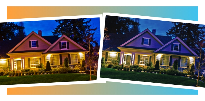
The color temperature of white light can be broken down into a range on the Kelvin temperature scale. Fry says that 2,700 K is considered a warm hue that will appear more yellow or orange to the naked eye.
“On the cooler side, you’re going to see a lot more white,” Fry says. “It’s crisp, with a little more white blended in. That’s why a lot of commercial properties use a higher Kelvin to light up sidewalks and the sides of white buildings — they want it to be seen.”
Understanding the client
Because lighting is subjective and tastes vary by client and by region, Kevin Smith, CLVLT, national technical support specialist and trainer for Brilliance LED near Phoenix, says learning about the client’s preferences is always first on his to-do list.
“What I like in lighting may not be what you like or vice versa,” Smith says. “It really comes down to how the customer feels about light. We can direct them the best we can, but it always comes back to what the customer wants. You always have to ask the customer how they feel about light, what kind of tones they like and what the lighting is for.”
“We can direct them the best we can, but it always comes back to what the customer wants. You always have to ask the customer how they feel about light, what kind of tones they like and what the lighting is for.”
— Kevin Smith, CLVLT, national technical support specialist and trainer, Brilliance LED
Though clients may not be able to verbalize or discern specific color temperatures, Fry says he asks clients what they have seen that they like. He says he also considers the vibe of the neighborhood. “I will drive by at night to look at what the neighbors have,” he says. “The best case is that the client has seen something that they like.”
Understanding how the space will be used based on the client’s lifestyle is also important when formulating a lighting design. Smith says he always walks a property with a client to better understand why they want or need light.
“For pathway lighting, I will ask a customer how well they see at night,” Smith says. “If it is an older customer, I might need to bump up the Kelvin temperature to help them see from point A to point B. I’ll also ask who comes to visit most often and how well they see at night, because most visitors are in the evening hours. Then, I’ll choose a static Kelvin temperature to make it safe all the time.”
 Creating a canvas
With an understanding of what a customer is hoping to achieve with lighting, Fry says he approaches a lighting design as if he’s painting a canvas.
“We approach it as an art where 2,700 K, which is the low end of the scale, is the canvas,” he says. “Then you have specific focal points, like a natural stone face on the house or a brick or stone walk, or maybe a water feature. That’s how you’re going to change the color spectrum.”
Garber says he also approaches lighting design like a painter. “You’re a painter. Your canvas is the house, and the landscape and the lightbulbs or integrated fixtures are your paint. And it’s a matter of being able to mix the colors with the color of the house and the foliage to do what you want it to do,” he says. “But it all depends on what the customer wants, because it’s all subjective and the owner can still say it’s ugly when it’s done.”
“You’re a painter. Your canvas is the house, and the landscape and the lightbulbs or integrated fixtures are your paint.”
— Tom Garber, president, EmeryAllen LLC
Those with a solid understanding of lighting temperatures and the looks they achieve can also mix color temperatures to create visual interest. “The foliage or color of the building that you’re lighting up will have a lot to do with the color temperature itself,” Garber says. “I once saw a landscape with a particular plant where the underside was a silvery white. The contractor lit the top of the trees with 2,700 K downlighting and uplit the underside with 4,000 K to accentuate the whiteness or brightness of the underside of the leaf. I never saw anything that looked so good before.”
As a general guideline, Fry says that 2,700 K is a good starting point for tree trunks and darker colors, 3,200 K to 3,500 K is good for things like conifers, spruces and cedars, and 3,000 K to 4,000 K is well suited for tree canopies and other lighter plant material and architectural features.
“As we all know, there are a lot of homes with white columns,” Fry says. “When we go into a job with white columns, our rule of thumb is 3,000 K. That’s our bare minimum on that and what seems to really work for us.”
Security considerations
While lighting adds to the beauty of landscapes and architectural features, it also serves the very practical purpose of enhancing security.
“Any time you use subtle landscape lighting you are going to create security, because the light output for landscape lighting is a lower lumen than the line voltage fixtures, which are 120-volt and above,” Fry says. “Like how a full moon lights everything up and you can see everything — that’s what you’re after. You don’t want it to be so bright that you create dark spaces. A bad guy’s best place to hide is in the dark space.”
Though it might seem like a brighter light is better suited to enhance security, Smith cautions that the opposite may be true. “Many lights are really, really bright, and humans are attracted to light, which can create momentary blindness,” Smith says. “We have to make sure we are directing and shielding the light to the proper areas.”
Other considerations
In addition to understanding client preferences and needs and the basics of the Kelvin scale, there are a couple other things to keep in mind when designing lighting — namely, the health of both trees and people.
“Trees may need to be timed differently because they have to go through photosynthesis, so you have to make sure those shut off before things like pathway lights,” Smith says.
In addition, because people react to light, some designers are considering sleep patterns in their lighting designs. “Many designers are now designing circadian rhythm lighting,” Smith says. “Maybe some lights in a landscape are going to be at a higher Kelvin for a certain amount of time. If they’re controllable lamps, they can then bring them down to a warm color temperature or even an amber, so if the homeowner gets up at night and peeks out the window, the amber light or low Kelvin temperature won’t disturb sleep patterns like a 5,700 K bulb would stimulate your mind.”
Educating customers
While choosing the right color temperature certainly enhances a landscape, Garber says that the best lighting designs are not all about color temperature.
“The Coloring Rendering Index, or CRI, in many cases is just as important, if not more important, than the actual color,” Garber says. “CRI talks about clarity of light. It’s like having cataracts and having them removed. It’s the difference between being able to see fuzzy and a little gray or seeing very clearly and bright.”
CRI ranges from zero to 100, and bulbs on the higher end of the scale will produce light closest to daylight or incandescent light, Garber says. “All bulbs are not the same,” he adds. “Do your homework. If you have to have a more economical presentation for your customer, don’t skimp on the bulb, don’t skimp on the light engine.”